Project overview
The product:
This project is improving the Vithas Hospital appointment app to provide customers with the ease of making appointments on their new online system. I noticed that our competitors offer dedicated mobile apps for their customers to make appointments and they have been very successful in providing this digital service, Vithas traditionally used phone appointment service and have recently moved to digital appointments.
Project duration:
January 2022 to March 2022
My role and responsibilities:
UX designer; User research, conducting interviews, paper and digital wire framing, low and high-fidelity prototyping, conducting usability studies, accounting for accessibility, and iterating on designs.

Problem:
Busy clients who don´t want to waste time making phone appointments
Getting quick appointments
Clients want to be informed about services on offer to maximise insurance coverage
Goal:
Design an app for Vithas hospitals that allows users to easily make appointments with their preferred doctors quickly
Improve knowledge about services on offer for client’s specified needs
Enhance the user interface for a more pleasurable and clearer experience
User research summary:
I conducted interviews and created empathy maps to understand the users I was designing for and their needs. A primary user group identified through research was working adults who didn’t have time to make appointments telephonically and wanted to use online appointment services such as Vithas. This user group confirmed initial assumptions about difficulties making appointments by phone, however, research also revealed that getting an appointment whilst they still had their flu-like symptoms was almost impossible. Other user problems included choosing doctors of preference and repeating appointments.
pain points
1
Parents and adults are limited in time and need an online booking app.
2
With flu-like symptoms, their appointments are too far away.
3
When phone appointments are made, they are offered only one doctor as a choice.
4
International users find it difficult to understand days, times and doctors’ names over the phone.
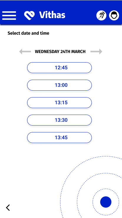
Digital wireframes


Usability study: findings
I conducted two rounds of usability studies. Findings from the first study helped guide the designs from wireframes to mockups. The second study used a high-fidelity prototype and revealed what aspects of the mockups needed refining.
Round 2 findings:
Text and button sizes are too small
A simpler interface and visual design are needed
Make the action button more visible
Round 1 findings:
Users want to make and edit appointments quickly
Users want date and doctor preference options
Users want a simpler homepage
Early designs allowed for some customisation, but after the usability studies, I added a clear action button to make appointments. I also revised the icon sizes and text proportion. I added edit appointment options to avoid users leaving the booking process. I also revised the design so users see all the confirmation details when they confirm. I revised the simplicity of the first page for making an appointment based on usability study I improved the usability by offering a quick visit ¨QUICK STOP¨ meaning the earliest opening alongside doctor's speciality option. I also included previous doctors as an option to repeat.